![MK Gallery Saul Leiter installation [photo: Rob Harris]](https://photomonitor.co.uk/wp-content/uploads/2025/01/MK-Gallery-Saul-Leiter-Selection-High-Res-17-330x220.jpg)
![MK Gallery Saul Leiter installation [photo: Rob Harris]](https://photomonitor.co.uk/wp-content/uploads/2025/01/MK-Gallery-Saul-Leiter-Selection-High-Res-22-330x220.jpg)
![MK Gallery Saul Leiter installation [photo: Rob Harris]](https://photomonitor.co.uk/wp-content/uploads/2025/01/MK-Gallery-Saul-Leiter-Selection-High-Res-42-330x220.jpg)
![MK Gallery Saul Leiter installation [photo: Rob Harris]](https://photomonitor.co.uk/wp-content/uploads/2025/01/MK-Gallery-Saul-Leiter-Selection-High-Res-60-330x220.jpg)
![MK Gallery Saul Leiter installation [photo: Rob Harris]](https://photomonitor.co.uk/wp-content/uploads/2025/01/MK-Gallery-Saul-Leiter-Selection-High-Res-63-330x220.jpg)
![MK Gallery Saul Leiter installation [photo: Rob Harris]](https://photomonitor.co.uk/wp-content/uploads/2025/01/MK-Gallery-Saul-Leiter-Selection-High-Res-65-330x220.jpg)
![MK Gallery Saul Leiter installation [photo: Rob Harris]](https://photomonitor.co.uk/wp-content/uploads/2025/01/MK-Gallery-Saul-Leiter-Selection-High-Res-25-330x220.jpg)
![MK Gallery Saul Leiter installation [photo: Rob Harris]](https://photomonitor.co.uk/wp-content/uploads/2025/01/MK-Gallery-Saul-Leiter-Selection-High-Res-13-330x220.jpg)
![MK Gallery Saul Leiter installation [photo: Rob Harris]](https://photomonitor.co.uk/wp-content/uploads/2025/01/MK-Gallery-Saul-Leiter-Selection-High-Res-24-330x220.jpg)
![MK Gallery Saul Leiter installation [photo: Rob Harris]](https://photomonitor.co.uk/wp-content/uploads/2025/01/MK-Gallery-Saul-Leiter-Selection-High-Res-1-330x220.jpg)
![MK Gallery Saul Leiter installation [photo: Rob Harris]](https://photomonitor.co.uk/wp-content/uploads/2025/01/MK-Gallery-Saul-Leiter-Selection-High-Res-47-330x220.jpg)
__________
This is a beautifully conceived and installed show, which helps get a better sense of the work of Saul Leiter. The curatorial hand is subtle. The show avoids a chronology and includes both his colour and black and white photographs and also importantly his paintings. Quotes from Leiter and critics help give a better sense of him and his art but do not close the work down.
Leiter photographed — so the show tells us — every day for 60 years and predominantly in the East Village neighbourhood where he lived most of his life. The artist died in 2013, so what is exhibited is still only a tiny selection. An introductory wall text spells it out: “He produced around 15,000 black and white prints, 40,000 colour slides, a similar number of black and white negatives and over 4,000 paintings only a handful of which were ever displayed.”
The work on show dates mainly from the 1950s to the early ’70s; commercial work preoccupied him from 1960 until he closed his commercial studio in 1981. Some of his fashion work is also included and placed among his non-commercial work, a response to his claim he never differentiated between the two. His fashion work, like his street photography, is subtle and quiet, it lacked punch and was somewhat atypical because of this.
Leiter’s success came late in his career. It was only in his 80s when he began to gain widespread recognition after his first book was published to acclaim: Saul Leiter: Early Color, 2006. But he does not really seem to have been that fussed, as one of the wall quotes from the artist that run through the show delightfully reveals: “I’ve enjoyed having books. I’ve enjoyed looking at paintings. I’ve enjoyed having someone in my life [the model and artist Soames Bantry] that I care about and who cares about me. I attached more importance to that than I did to the idea of success.”
It was interest in Leiter as an early colour photographer that sparked all the excitement— he began working with colour slide film in 1948. And it is still his colour photography in the show that is the most interesting and distinctive. The exhibition title “An unfinished world” is taken from the last words of a quote by him that is presented on the wall of the first room— “Photographs are often treated as important moments but really they are little fragments and souvenirs of an unfinished world.” “Little fragments” is a good way of describing his photographs. The incomplete photograph is central to his pictorial strategy in which he will often use structures and screens to partially obscure or frame a view and give us just a little tantalising glimpse of the world. What he meant by “An unfinished world” is less immediately clear. I take it to mean that sense of a world being uncontainable by the photograph. The world exceeds what the picture can frame and that sense of limitation becomes a virtue for Leiter as he incorporates that limit into his way of picturing. There is also a modesty in the quote. Both the quality of his work and his relative obliviousness to success and ambition reflect a less ego-centric artist. Against the grander claims about the photographer capturing an important decisive moment, his pictures offer us less decisive and emphatic moments. His way of picturing emphasizes the condition of all photographs as incomplete, mere scraps of the real. His love of ellipsis, his minimal and quietist aesthetic and sensibility are in many ways all connected with his enthusiasm for Japanese art— Hiroshige, Hokusai, Zen paintings, calligraphy, the tea ceremony, Haiku are all as important as the more obvious Western art allusions his photography can be seen to make.
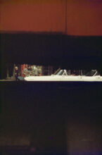
With his vertical colour photograph, Through Boards, 1957, all figurative detail and narrative incident is contained in a horizontal band, a slice of street life and noise that takes up only about an eighth of the picture, the rest given over to the abstract visual planes, red and black, created by the boards he views the scene through. The red area at the top has a fuzzy stained edge as it shifts to black below and a black line also runs vertically through it. The boards seem to have provided him with readymade surfaces that invite comparison with qualities and effects found on contemporaneous abstract paintings— there is an obvious relation to Mark Rothko’s paintings with this photograph.
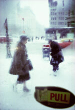
With Canopy, 1950s, its near blackness takes up three quarters of the frame and its ragged edge seems to fit with the twists and turns of people caught in the view of a snowstorm pictured outside and below it, a scene with only the merest hints of colour. Leiter also liked views that are diffused: Pull, 1960, for example, rests upon the interplay between the forms of two figures in the snow outside and the dark shape made by the pull sign on the steamed-up glass door they are viewed through. The world is simplified and abstracted. Snow, of course, is delightful because it alters what is familiar, covers up the details of the world.
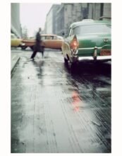
In a rare, eventful black and white photograph, the aftermath of an accident on the street is vignetted by the blurred presence of two onlookers standing in front of Leiter. A policeman is crouched and writing in a notebook beside a man on the ground— the mouth of the man on the ground is open, he is in agony or dead. It is a dramatic and tragic moment but viewed at a distance and framed by the bodies of other observers it becomes something else, a beautiful miniature.
In this curation, small print sizes gave many of the reframed views the quality of miniatures. With Driver, 1950s, the luscious red of a canopy, filling three quarters of the pictorial field, is broken by a view into and through the back of a car. We see a driver’s hatted head and profile as he turns to his right. There is no-one visible in the passenger seat. It is the clarity and detail of this little observed moment and portrait that seems to emphasize and condense an essential and defining quality of photography, and this is then set in relationship to an expanse of pure colour which points beyond photography to the formal language and qualities of some abstract painting.
Leiter was a painter before he was a photographer and painted all his life, and mostly abstractions. He never painted largescale, though he was friends with Abstract Expressionist painters. There is an amusing quote from the painter Franz Kline in one of the framing texts: “If only you painted big, you’d be one of the boys”. In an interesting relation two of his small watercolour and gouache paintings on Japanese tissue paper, framed and behind glass, are displayed together with a smaller framed black and white photograph printed on a scrap of paper. Its image is a little unclear and it was only when I read a text about him making what he called “kitchen paintings” and how he would wake up in the middle of the night and paint one of them while heating the water for his coffee that I realised it was a photograph taken from this little domestic detail. The relation sets up very well the tension between the ordinary-world-boundedness of photography and painting’s separation and departure from it. But at the same time as Asa Hiramatsu has noted, because Leiter would also paint on the covers of damaged books, on scraps of canvas, on packing materials from wine cartons and even on orange peels: “It was as if the act of painting and the mundane everyday were riding a seesaw together. His paintings were bounded to the life he lived.”
Leiter’s colour photograph, Window, 1957 is like a readymade painting but at the same time remains indelibly photographic. It sets up an optical play between the window’s surface of green painted glass that is crackled and flaking off and what it reflects from the street: nothing special or momentous, just a parking meter, cars and buildings. But what makes the picture is the detail of a few bright red tins inside the shop, made visible and vividly present as the glass becomes cleaner and clearer at the bottom of the window. It is a straight photograph but nevertheless rich and complex, reliant on the dynamic relationship between the two complimentary colours, green and red, and the shifts between the glass surface’s painted opacity, its reflection, and its transparency.
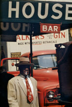
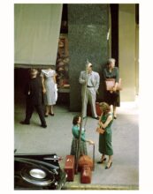
A colour photograph — both untitled and undated and posthumously printed in 2021— showing a man installing or cleaning or fixing a sign, the letter W luminescent orange-red, becomes interesting because it is viewed through a rhomboid-shaped opening. Such signage could cue a Pop aesthetic but instead is used to create a curious and enigmatic cameo. The partial view abstracts and it becomes a picture about shapes and colour, an interplay between the figure of the man and the letter that appears bigger than him and that diamond or tear-drop shape that frames both him and the W. In a view taken at night, Looking Down, 1953, all life and colour are in the top of the picture. An overhead view shows a couple presumably entering a hotel. They are illuminated by the building they enter. The rest of the picture is given over to nothing but the deadness and darkness of the street at night. In the brown gloom there seems to be another couple behind them, but they are barely visible. It is the turquoise light from the neon sign on the building that is the primary pictorial interest, illegible when viewed from above, the sign leaves beautiful little leakages of colour. Pop consumer signage is translated into something else, an aesthetic closer to his paintings.
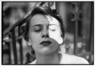
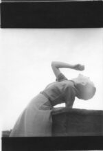
Towards the end of the exhibition are Leiter’s photographic nudes, pictures made in the 1950s in his East 10th Street studio. These pictures of women, like his street photography are not about a power play, the exchange seems tender, intimate, loving. In a black and white Bonnard-inspired photograph of a woman partly submerged in the bath, her figure is diffused in the soapy water. A grey flannel covers her groin, its formless shape a counterpoint to the grace and beauty of her naked body, redrawn by the milky bathwater. In 1980, abandoning the idea of publishing them, he started painting over the prints, but the results are not as engaging.
The last room of the show is given over to an extract from Tomas Leach’s 2013 film about Saul Leiter. He is chuckling throughout as he reflects on his work and life from his cluttered and disorderly studio, surrounded by stacks of boxes of prints and books. Laughter suits his work. Not that it is comedic but that it is joyous. One of the most revealing wall texts in the exhibition sums up his approach to photography: “I have a great regard for certain notions of beauty even though to some, it is an old-fashioned idea. I do not think that misery is more profound than happiness.”
Photography made from life in the street can reflect states of misery and social disharmony. It can be noisy, discordant, abrasive, brutal and confrontational. The joy of so many of Leiter’s pictures is that they are anything but.
__________
Mark Durden is a writer, artist and academic. His many publications include The Routledge Companion to Photography Theory, co-edited with Jane Tormey, (Routledge 2019), Photography Today (Phaidon 2014), which has subsequently been translated into French, Spanish, Turkish and Chinese, Fifty Key Writers on Photography (Routledge 2012), which has been translated into Chinese and Farsi. Together with David Campbell and Ian Brown he works as part of the art group Common Culture. Since 2017 Durden has worked collaboratively with João Leal in photographing modernist European architecture, beginning with Álvaro Siza. He is currently Professor of Photography and Director of the European Centre for Documentary Research at the University of South Wales, UK.