

Letters on Photography by Kim Beil and Annebella Pollen
Correspondence Course began as a creative adventure during the confinement of Covid lockdowns. While the doors to many museums and archives were still locked, two historians of visual culture, Annebella Pollen and Kim Beil, sent each other, by post, photographic curiosities and ephemera as gifts and as writing prompts. The resulting eight essays are written as personal letters. They are informal, reflective takes on photographic history and collecting, with research folded into autobiographical stories. The project takes its name from the first item sent out across the sea: a guide for a 1960s educational course on camera technique taught remotely, via post. Below, Pollen and Beil present these Correspondences as an evolving series of Photomonitor Experiments.
__________
Correspondence Course 5
From Annebella Pollen to Kim Beil:
Last week I read an interview with photography historian, Geoffrey Batchen (on the website Art Breath). He was asked to reflect on how Non-Fungible Tokens might affect the field of photography and he said, baldly: “I don’t think NFTs have much to do with photography so their impact on the field is likely to be negligible.” He reflected on the medium, “at the moment, its most obvious equivalents are baseball cards, images of no pictorial value made financially desirable only through the imposition of an artificial rarity.” There I had it: the hook I had been seeking to help me understand the material you had sent: three photographic baseball cards from the 1920s to 1990s.
“Images of no pictorial value” is such a curious conception. The very idea rankled. How can there be such a thing? The other day I had to quickly summarise what I do, and I found myself forming the words “historian of the photographically oblique”. I think you are the same. We look again at the overlooked, at the taken-for-granted. As analysts of visual culture, we look at the structures that condition our looking. And so, you had sent me photographic trading cards, but they foxed me.
We discussed at the outset of our project that we would send each other material from our home locations – in the US and the UK – to add to the international dimensions of our transatlantic pen pal exchange. Baseball is a sport that has never taken off in a big way in Britain, although at secondary school, its close cousin, rounders, was enforced upon me weekly. Initially the baseball cards didn’t hit home; I couldn’t get past first base, but I thought I’d make a pitch, nonetheless (see how the terminology has entered my everyday speech). The more I looked, the more I understood.
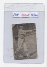
I may not know much about Merton Nelson of the 1928 San Francisco Mission team (number 28 in a series), nor of Barry Bonds, his 1994 equivalent (number 6 of 10). But I do know about their opposite numbers in 1970s British football, where photographs of players in team colours could be bought in sticker packs, for five pence a time, in newsagents and sweetshops everywhere, and whose faces adorned primary school lunchboxes and pencil cases, as well as the official albums they were meant to fill (but never did, quite). Before them, earlier in the century, photographs, or sometimes photographically inspired illustrations, were distributed with cigarettes or boxes of tea (I have the Player’s cigarettes film star set and the Brooke Bond wild flower set framed on my office wall).
They were sales incentives, objects manufactured to be collectible, and crucially, they came in series. They often spoke to children – football stickers, for example, were designed to be pocket money prices at a penny each – but they appealed to fans and completists of any age. They were also a sociable form, hence their status as trading cards. It was unlikely that purchased packs contained precisely what was needed to complete a set, and certainly there was a lively culture of ‘swapsies’ for doubles and rarities in the playground when I was growing up (if an album couldn’t be completed by swapping, remaining stickers could be bought from the manufacturer but at much higher prices). I remember, too, that they were viewed with hostility by teachers and parents for encouraging juvenile expenditure, and for their associations with junk food (there were always collectible series offered in sugary breakfast cereal and bubble gum). Interestingly, it was ever thus. News reports in the US in the early twentieth century worry that trading cards were turning children into smokers, gamblers and thieves. A friend who went to a British hippy school told me that all forms of collectibles were banned in the 1970s and 1980s, as they were perceived to encourage capitalist acquisitiveness; the pupils exchanged rainbow coloured pencil sharpenings instead, with gold and silver having the greatest premium as a swap. The collecting urge could not be repressed.
The earliest of the photographic cards you sent me was a free gift with Zeenut, a defunct sticky popcorn, peanut and coconut confection made by a Californian candy company, Collins-McCarthy, who seem to have produced over 3,000 different baseball cards from 1912-1938, according to collectors’ sites. Nelson, its capped, socked and knickered subject, stands barely 2 x 3 inches high and is depicted in monochrome, in action, in a modest card lettered with the brand, his team and his surname. The card is blank on the back. I’d like to think its dog-eared condition shows its active life being swapped for the best part of a century around American schoolyards, but it may be that it has been passed more between adult profit seekers, as it is now housed in an Ultra-Pro trademarked rigid polypropylene sleeve, showing its status as a commodity that must be protected for its financial value to be realised. Fair enough, perhaps, when the highest selling card has topped $5 million.
The cards’ 1990s iterations that you sent me came sealed in advance with protective film in recognition that purist traders want a pristine offer; the big business nature of the sport, too, by the 1990s, is emphasised by logos, the copyrighted maker’s name (Donruss, later bought out by Panini) and a gold foiled seal to suggest gravitas and authenticity. The reverse included a textual evaluation of the player’s merit, a later staple of the form. Curiously for a 1990s product, however, it simulated earlier photographic technology: the 35mm slide, popular in the 1960s. The transparency, when held up to the light, illuminates the player’s concentration like a secular saint in beatific pose in a stained-glass window. The 1995 iteration is called a “photodisk”, whose prismatic form borrows from the contemporaneous CD, and whose radial shape recalls Mattel’s stereoscopic View-Master reels, whose origin date coincides with the Second World War. These new-old references combine in a trading card tradition that spans much of the twentieth century.
The telling detail, for me, in the 1995 example, is that it is part of a series, but it is 7B of 8. It must be partnered with a (missing) 7A to make up its southern hemisphere / other half. This reminded me so clearly of my own collecting frustrations as a young teenager. I didn’t collect sport but pop stars, and I would often be left with half a band because the manufacturers had sectioned up the stickers to make the pursuit harder. As a child, when I looked at footballers or singers, I didn’t see them as photographs. They were pocket-sized pin-ups, realistic representations of usually remote heroes, in affordable forms you could take home and keep. But with distance, I now see that, as photographic collectibles, they were designed to pull on my heartstrings and to keep me wanting more, with calculating manufacturers over- and underproducing to fix the market. As such, they meet Batchen’s accusations of commodity fetishism and inflation. But are they without pictorial value?
The shapes these photographs take are not without style. The footballer portraits I remember from my childhood were head-and-shoulder shots where the hairstyles filled the frame; the 1970s was a time when bouffant perms were legendary in the British game. The players would line up one-by-one for the official photographer but occasionally a player had to be added later, leading to curious anomalies where a footballer might appear holding a cigarette, for example, or where players had to have a new kit quickly painted on in post-production if they changed team late in the day. The American baseball examples have their own visual formulae. In their limited space, they show players in action, often in postures denoting determination and sporting intensity. This was the mode mimicked by conceptual artist Mike Mandel when he produced a 1975 series of portraits of 134 photographers, curators, critics and art historians, each dressed in baseball gear complete with bat, ball and glove. Available in packs of ten, and accompanying Topps bubble gum, as was the trading card way, the parodic series showed both the closed community of the 1970s art world, and its proximity to consumer culture. American Conceptualism played with popular visual vernaculars and showed the art world to be a parallel expensive game.
__________
With thanks to Annebella Pollen and Kim Beil for their text and images.
Annebella Pollen has been writing about photographic archives and lesser-known visual histories for over twenty years. She is the author of five books: Mass Photography (2015); The Kindred of the Kibbo Kift (2015); Nudism in a Cold Climate (2021); More Than a Snapshot (2023) and Art without Frontiers (2023). She is Professor of Visual and Material Culture at University of Brighton.
Kim Beil is an art historian who teaches at Stanford University. She is the author of two books: Good Pictures: A History of Popular Photography (Stanford, 2020) and Anonymous Objects: Inscrutable Photographs and the Unknown (MACK, 2023). Her writing on photography and visual culture also appears in the New York Times, the Atlantic, the Believer, and Cabinet magazines, among many other publications.