
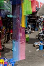

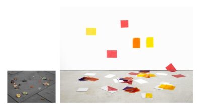
Since 2009 when I started to produce images and until 2017 when I decided to study at the RCA, my work has always been divided into series linked to a specific topic. Part of this was because when I was applying to open calls, I was forced to organize my work into series and the edition could never be longer than ten or twelve photographs.
In 2017 when I started my MA at the RCA, I was still working in the same format until I realized by exploring different approaches and techniques in my work that the subject of my photographs was no longer specific to a topic condensed in a short series but present throughout my body of work.
The title of the portfolio I’m presenting here “I think my work is about colour” criticizes the fact that as an artist we always need to know precisely at any moment what is our work, forcing us to follow precise style guidelines and narrow the meaning of our work to small series instead of exploring it from a wider perspective.
In other words, I think my work is about colour and many other things.
– Ignacio Barrios
__________
Below you can find two questions reflecting on other dimensions of the work that Christiane Monarchi (editor of Photomonitor) asked me during my degree show that RCA that explore this topic.
Q: When I approached your works at the RCA for the first time I wasn’t quite sure where to look. From afar these candy-coloured shapes appeared to float unaided, and closer cursory inspection revealed their 2D representation however also hints of the subjects’ 3D construction. It’s been a long time since I have been allowed to look at a photograph and marvel at its sculptural traits. Could you take me back to the first thought behind the selection of materials you have manipulated part of this body of work?
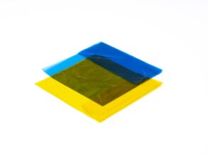
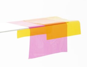
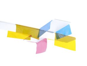
A: I always thought of colour as a very fluid quality of an image, so my main goal was to photograph colour as a material. I think of it like bringing Donald Judd and Josef Albers together through photography. I used colour acetate sheets as their transparent quality enabled me to create depth in the images and highlight the space.
They appear to be 2D representations because we almost don’t see the supportive structures of the objects.
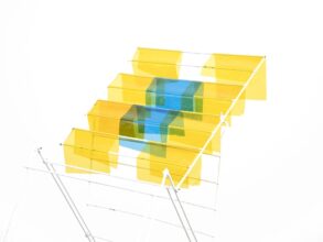
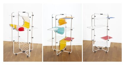
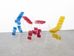
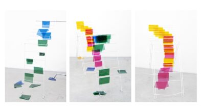
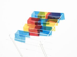
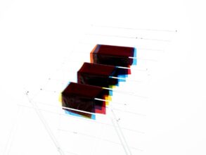
The constructions in my photographs are based on elements of our daily life. Several of the images here contain drying racks used to support and divide the space in my photographs like they normally do in our domestic space. The drying racks play a very important role in my photographs because they enable me to connect the viewer with our domestic space and to elevate the ordinary, the household object, to the material and sculptural.
( see 14. Drying Rack Composition #1, Royal College of Art , 2018)
I created these suspended colour spaces in the studio where the acetate sheets were placed on transparent acrylic or on an opaque white background. Because they are flexible, they can really wrap and hang off these supporting objects.
Our eye focuses on the materiality and the details of the transparencies themselves.
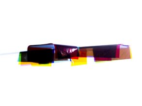
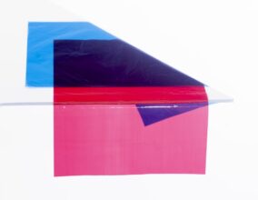
The colours then work in two directions, one where they are thick and opaque like paintings, the other where you see through them like in the process of colour photography where the transparent sheets blend.
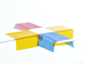
In Cross #1 (Yellow, Cyan & Magenta) you see both where the transparencies are able to layer and where they are obscured.
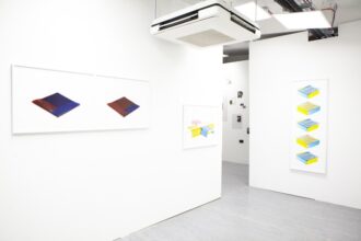
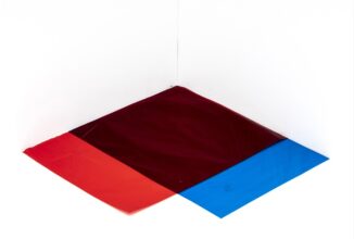
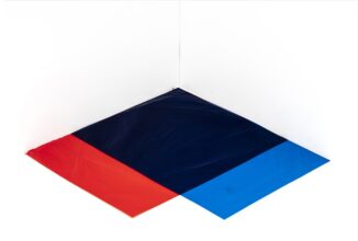
The diptych Cross Fold #1 (Blue on Red & Red on Blue) show the same space but reconfigured to show how one colour blends; how if you see blue on top of red, and then red on top of blue, it shows you different spaces.
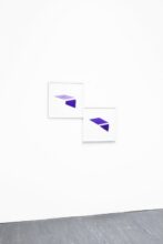
In the diptychs Cross #1 (Yellow, Cyan & Magenta) and Edge #1(Purple), 2019 I introduced movement where the two images represent the same object but photographed from different point of views . The idea is that, depending on the position that you have in space, the shape of the objects would reconfigure.
Q: The feeling conveyed by the .jpgs seen on this page do not convey the materiality, and heightened perception of the object when seen printed and exquisitely framed on the wall. How did you decide on the object qualities you wanted to work with in the finished prints?
A: As I said, the goal was to photograph colour as a material.
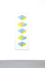
I decided to frame the work with a white frame so that it’s as if these shapes are floating in the gallery space. Basically, the white wall of the gallery becomes an extension of the white background of the photographs. Because of the kind of glass used to frame them, there is no reflection on the pieces, so that you would not think that these are framed photographs.
When you show an object photographed without a shadow, you don’t really perceive it as a photograph, but more as colour. I took as much information as I could out of the photographs so we could really focus on the materiality of the colours. In how I photographed them, how I edited them, and how they were displayed, the idea was that they are floating in this white space. That’s how your eye starts to focus on the material aspect of them; you don’t have anything else bothering you and distracting you.
It’s all about the surface, when we look at a printed image in its surface we see the pigments of the colour applied on the paper but in this case the wrinkles almost appear to be on the prints.
(Interview by Christiane Monarchi. Edited with the help of Hannah Walton. Special thanks to Tom Lovelace my tutor at RCA and Edgar Martins with the APS scheme at The Moth House. )
__________
Biography
Ignacio Barrios (b.1989, Geneva; based in London) is a Spanish visual artist working with photography. In 2019, Ignacio completed his Master in Photography at the Royal College of Art in London. Barrios mainly works with photography while blurring boundaries with painting and sculpture combining street and studio photography. He is the winner of the Genesis Imaging Postgraduate Award 2019 and has received three honourable mentions at the IPA Lucie Awards for his series “Urban Seascapes.”
Ignacio has enriched his photography by attending different courses at EFTI in Madrid and workshops with photographers such as Jose A. Figueroa, Javier Vallhonrat, Cristina Garcia Rodero, Antonio Xoubanouva and Oscar Monzón.
In July 2020, Ignacio will be an artist in residence at the BilbaoArte Foundation
Website: www.ignaciobarrios.es
Instagram: @ignaciobarrios